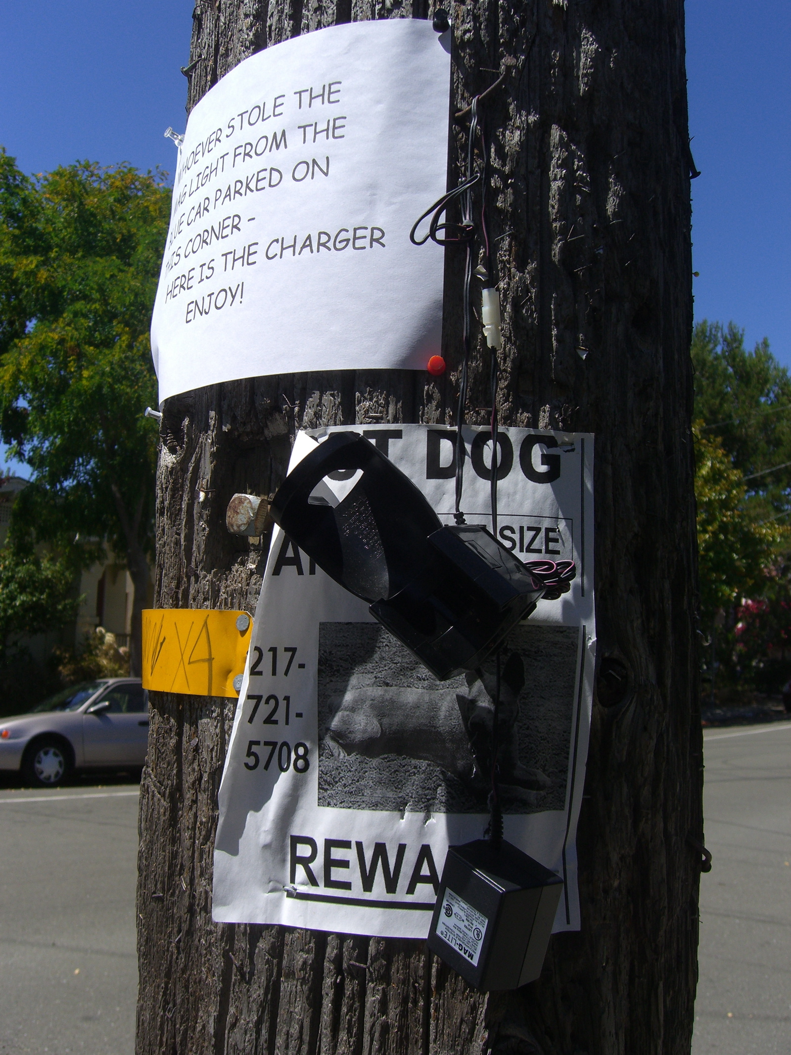
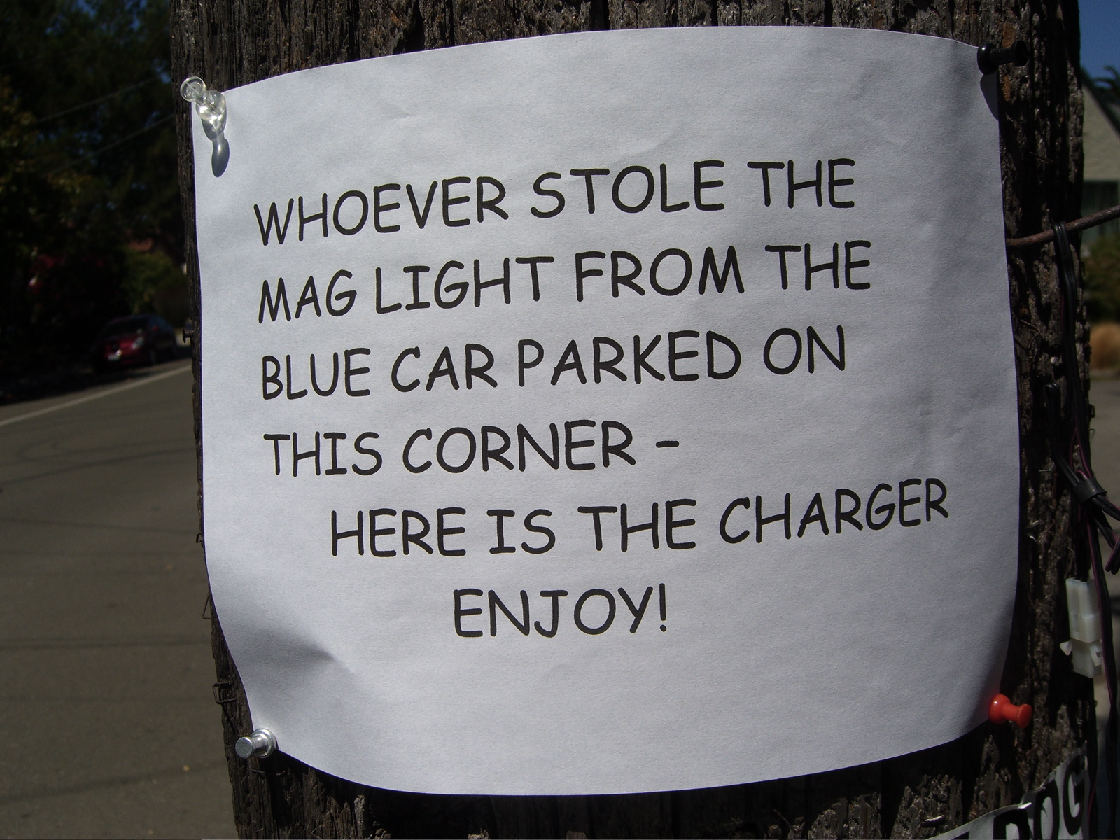
This is on the next street over from our place, of California Street at Jaynes. Not sure how long it has been hanging there. The message gets four stars on a scale of four, especially with the charger hanging there. I’m also taken by the font the aggrieved party has employed here–jaunty, but without detracting from the words’ impact. Henceforth, I’ll think of this typeface as Incensed Irony.
Technorati Tags: berkeley, berkeley crime
I suppose the two devices should be together. Good on him.
If they took the whole car, would he Lt. Gerard after them to sign over his insurance coverage?
That Lost Dog Reward sign has a 217 area code, which is for Central Illinois. I doubt it’s a typo. Someone from here must have moved out there with their cell phone. I may call them tonight. But, what would I say that could make me sound any less stupid than this comment? So, maybe I won’t.
The sign is great. The font is actually Comic Sans. Maybe Incensed Irony is a better name since its popularity incenses many people who care a lot about type. As for me, I spent about 5 years using it in all my presentations. I thought it made my talk seem more informal.